
Table of Contents
Elevate your deck-building business with a tailored website. Enhance user experience, showcase your brand effectively, utilize compelling calls to action, incorporate striking visuals, and include engaging elements. Partner with Stratedia to achieve exceptional results.
Your website serves as the core of your digital marketing strategy. It’s the first interaction potential customers have with your deck building business, making it crucial to invest in a website that attracts and converts leads.
In this guide, we’ll share five essential web design tips to help you create a more effective website. For assistance with developing your custom site, reach out to us at 860-415-0340 to connect with a strategist.
Let’s dive in!
1. Ensure Your Design is Mobile-Friendly
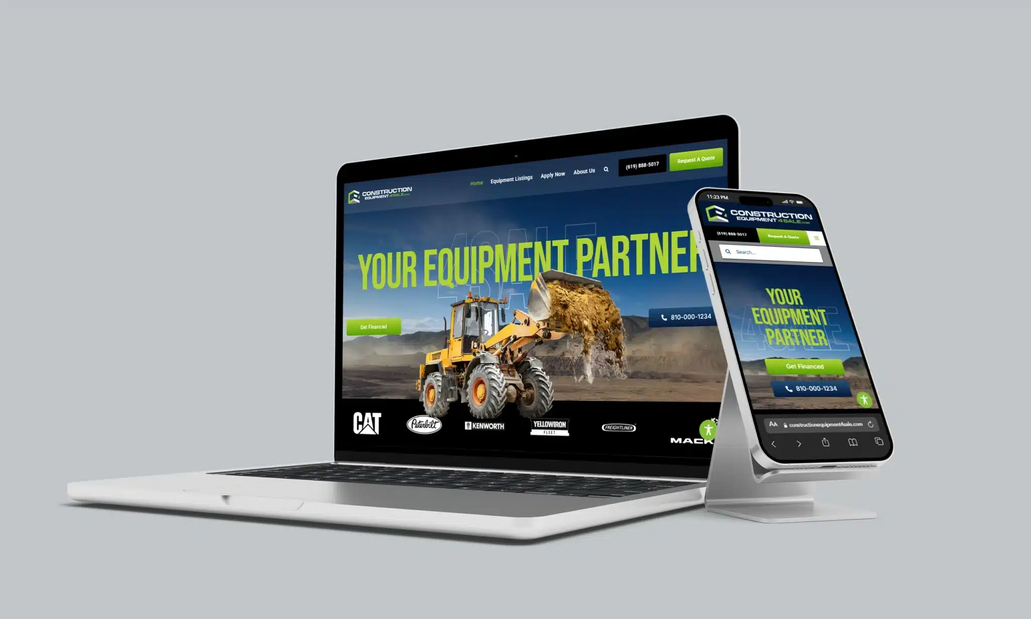
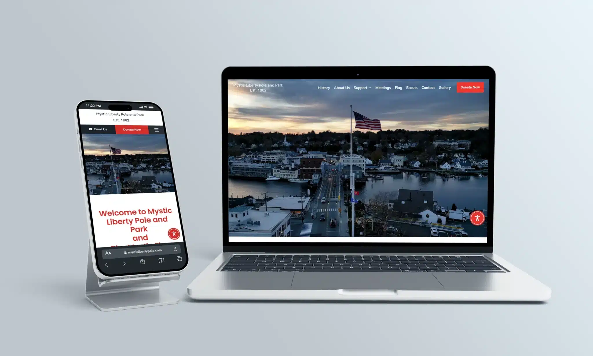
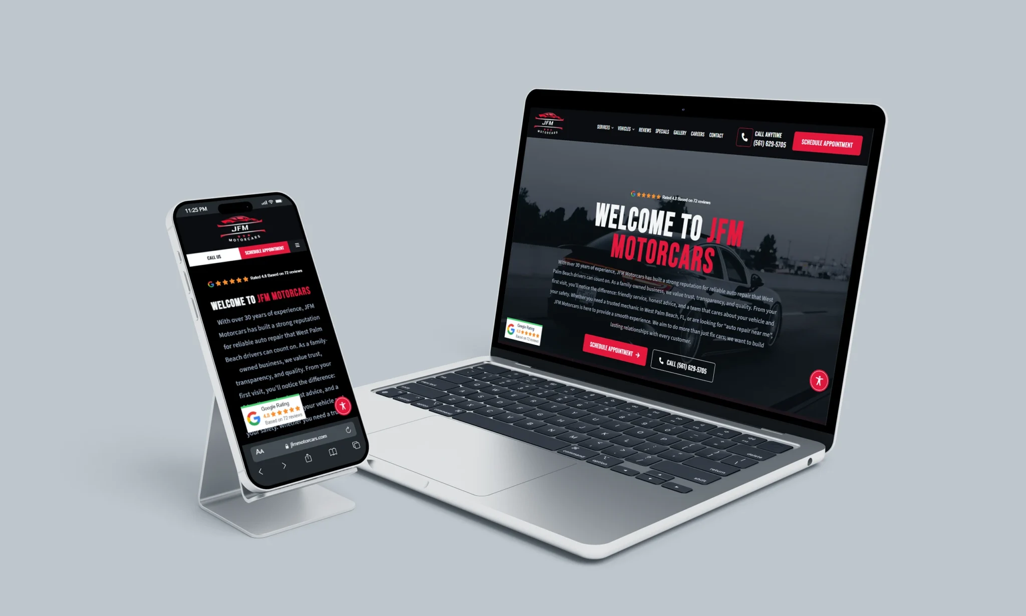
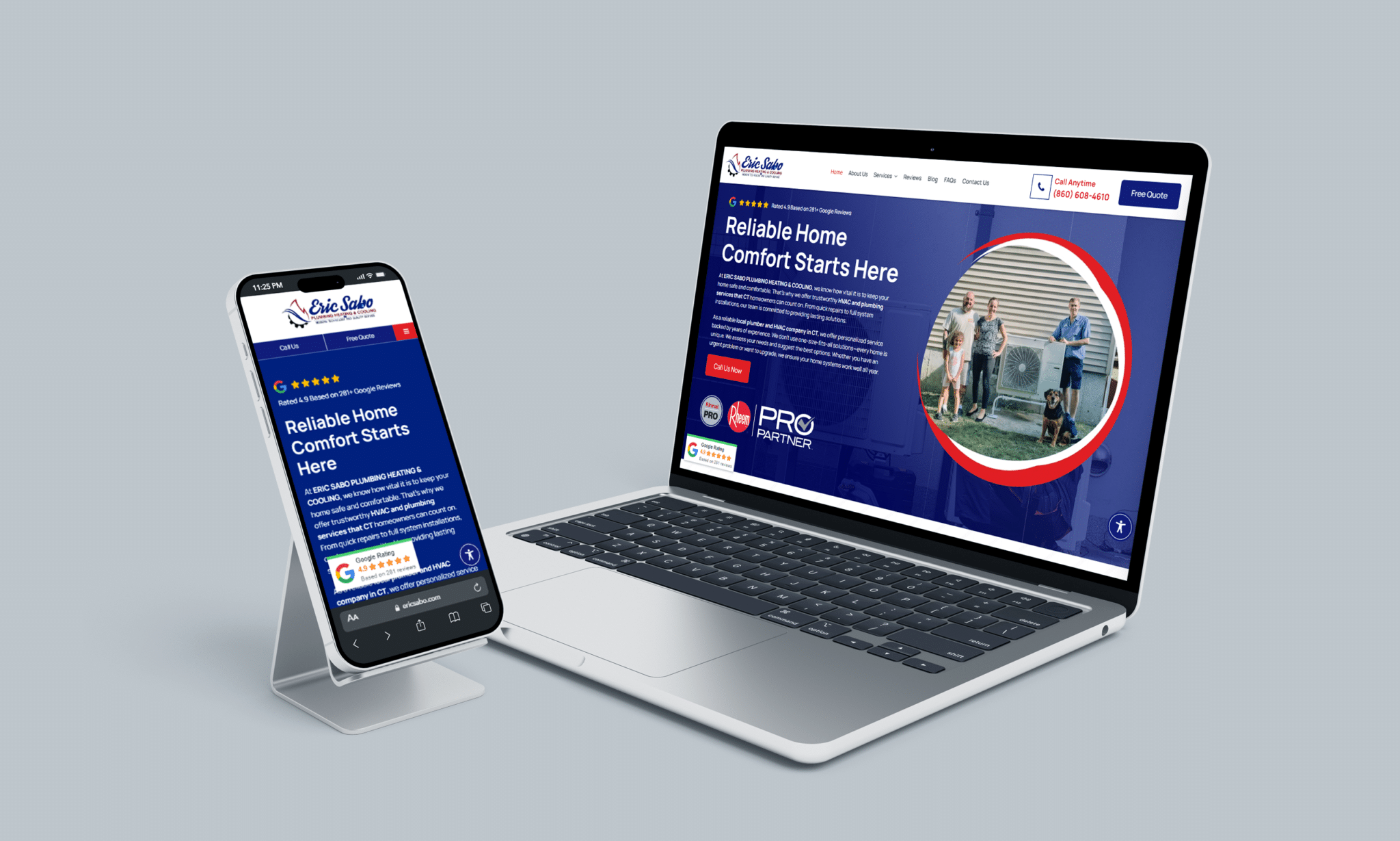
In today’s digital landscape, having a responsive website design is no longer optional—it’s essential. With an increasing number of users accessing websites from a variety of devices—be it smartphones, tablets, or laptops—ensuring that your site delivers a seamless experience across all these platforms is crucial.
A responsive design automatically adjusts the layout and content of your site based on the device being used. This means your site will look and function optimally whether viewed on a desktop, tablet, or mobile phone. Without this adaptability, users may encounter issues such as text being too small to read, images being misaligned, or navigation elements being difficult to interact with. These problems can lead to frustration and prompt users to leave your site for a competitor that provides a better user experience.
To create a responsive design, use flexible grid layouts, scalable images, and media queries that adjust the layout based on screen size. Regularly test your site on different devices to ensure that it performs well across all of them. By prioritizing a responsive design, you’ll ensure that every visitor has a positive experience on your site, which can significantly enhance user engagement and conversion rates.
2. Select Colors that Represent Your Brand
Colors are a powerful tool in establishing and reinforcing your brand identity. They can evoke emotions and convey your brand’s message more effectively than text alone. When designing your website, selecting a color scheme that reflects your deck building business’s brand is vital for creating a cohesive and recognizable online presence.
Consider the colors that your business already uses in other marketing materials, such as your logo, business cards, and brochures. Consistency in color usage helps reinforce brand recognition and build trust with your audience. Typically, a successful website color scheme will include a primary color that represents your brand, a background color that complements the primary color, and one or two accent colors that can be used for highlights and calls to action.
For example, if your brand is associated with earthy tones and natural materials, choose colors that reflect this aesthetic. A combination of greens, browns, and neutrals can evoke a sense of reliability and professionalism, aligning with the values of a deck-building business. Make sure to use these colors consistently across all elements of your website, from headings and buttons to backgrounds and borders, to create a unified and professional look.
3. Highlight Your Call to Action (CTA) Buttons
Call to action (CTA) buttons are critical for guiding visitors toward taking specific actions on your website, such as requesting a quote, scheduling a consultation, or signing up for a newsletter. These buttons need to be prominently displayed and easily accessible to effectively convert visitors into leads.
To ensure your CTAs are effective, they should be designed to stand out from the rest of your page. Use contrasting colors that draw attention without clashing with your overall color scheme. For instance, if your website has a dark background, a bright, contrasting color for your CTA buttons will make them more noticeable. Additionally, the text on your CTA buttons should be clear and action-oriented, such as “Get a Free Estimate” or “Contact Us Today.”
Place CTAs strategically throughout your website—at the top of the page, within the content, and at the end of articles or service descriptions—to maximize their visibility. Incorporate white space around CTAs to make them stand out and avoid overcrowding the button with too much text. Effective CTAs not only guide users but also drive engagement and conversions, making them a key element of your website design strategy.
4. Integrate Engaging Visuals
Visual elements are crucial for capturing and retaining your audience’s attention. They provide a break from text-heavy content and make your website more visually appealing and engaging. Effective use of visuals can enhance user experience and communicate your message more dynamically.
Start by incorporating high-quality photos that showcase your deck-building projects, team, and finished products. Authentic images that represent your business can create a genuine connection with visitors and provide a clearer understanding of what you offer. Avoid using generic stock photos, as they can feel impersonal and disconnected from your brand.
Videos are another powerful tool for engagement. They can be used to demonstrate your deck-building process, share client testimonials, or provide virtual tours of completed projects. Videos can capture attention more effectively than text alone and are increasingly popular among users looking for quick, engaging content.
Infographics are also valuable for presenting complex information in an easy-to-understand format. Use infographics to highlight key statistics, processes, or benefits related to your services. They help break down information visually, making it more digestible and memorable for your audience.
By integrating these visual elements, you’ll create a more interactive and appealing website that encourages visitors to stay longer and engage more with your content.
5. Include Interactive Features for Audience Engagement
Engaging your audience and encouraging interaction on your website is essential for building connections and fostering long-term relationships. Interactive features can help you gather valuable information about your visitors and make it easier for them to stay connected with your business.
Social media icons are a simple yet effective way to encourage visitors to follow your business on various social platforms. Place these icons in a visible location, such as the footer or header of your site, to make it easy for users to find and click. Linking to your social media profiles helps keep your audience engaged and provides additional channels for communication and promotion.
An email sign-up bar is another effective interactive element. It allows visitors to subscribe to your newsletter or updates, keeping them informed about your services, promotions, and industry news. Position the sign-up bar prominently on your site, such as in the header or footer, to ensure it is easily accessible. Keep the sign-up process straightforward by asking for minimal information initially, such as an email address, and offer value in exchange, like exclusive content or special offers.
Stratedia Can Create a Custom Website for Your Business
A tailored website can set your deck building business apart from the competition and attract high-quality leads that you can guide through the conversion process. With over 5 years of experience in crafting custom websites that deliver results, Stratedia is well-equipped to help you achieve your goals.
As a comprehensive digital marketing agency, we specialize in designing custom websites that meet your specific needs. Our dedicated team of experts will apply their extensive knowledge and skills to develop a website that effectively supports your deck building business.
Curious about what it’s like to work with us? Our client testimonials highlight the positive impact we’ve had on businesses just like yours. Reach out to learn more about how we can assist you in achieving your online goals.
Build Your Custom Website Today
Ready to develop a unique website for your deck building business? Reach out to us online or give us a call at 860-415-0340 to discuss your project with one of our strategists.
We’re excited to help you create a website that makes an impact!


