2020 HAS BEEN THE RISE OF MOBILE
The Whole World is in Your Hands, Literally!! Everywhere you go, you see someone on their phone, talking, texting, or reading. Been at a stop light lately? Look next to you and chances are you will catch someone looking down at their phone. We can’t help ourselves! In fact, while mobile is already here to stay, IT IS ONLY GOING TO GET BIGGER!
2.1 billion Consumers owned smartphones worldwide, according to the Internet Trends 2015 report.
Smartphones account for thirty percent of Internet Searches, according to data from the Global Web Index.
Smartphones also account for Sixty-six percent of all emails read on smartphones, according to the US Consumer Device Preference Report from MovableInk. According to Google, internet traffic soared by desktop traffic in 2015.
What does all this mean for your small business?
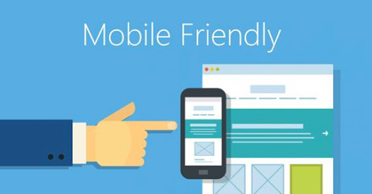
It’s vital that your website is mobile responsive. Google has made a real push to accommodate mobile audiences, customizing its search results to favor sites that are optimized for mobile use. For example, a responsive website will always perform better in search engine results compared to its non-mobile optimized competitor. Search Engines sites such as Google, Bing and Yahoo will continue to change their algorithms to put more weight on having your site mobile optimized.
There is a huge difference between your site being mobile enabled and being optimized. Enabled means that it can be seen on mobile while optimized means it can be navigated thru easily.
If you have someone designing or maintaining your website for you, be sure to discuss this with them. If you are maintaining your site on your own, make sure you run your site thru Google’s Mobile Friendly Tool to see if it’s optimized.
If you need any help designing or maintaining your site to be mobile optimized, give us a call at +1 (860) 222-4112. We Would Love To Work With You!


