Table of Contents
- Essential Web Design Features for OB/GYN Practices
- Why is Web Design Crucial for OB-GYN Practices?
- Top Design Features for Your OB-GYN Website
- Design an Inviting Color Scheme
- Ensure Intuitive Navigation
- Create a Welcoming Space for Communication
- Strike the Right Balance Between Visuals and Text
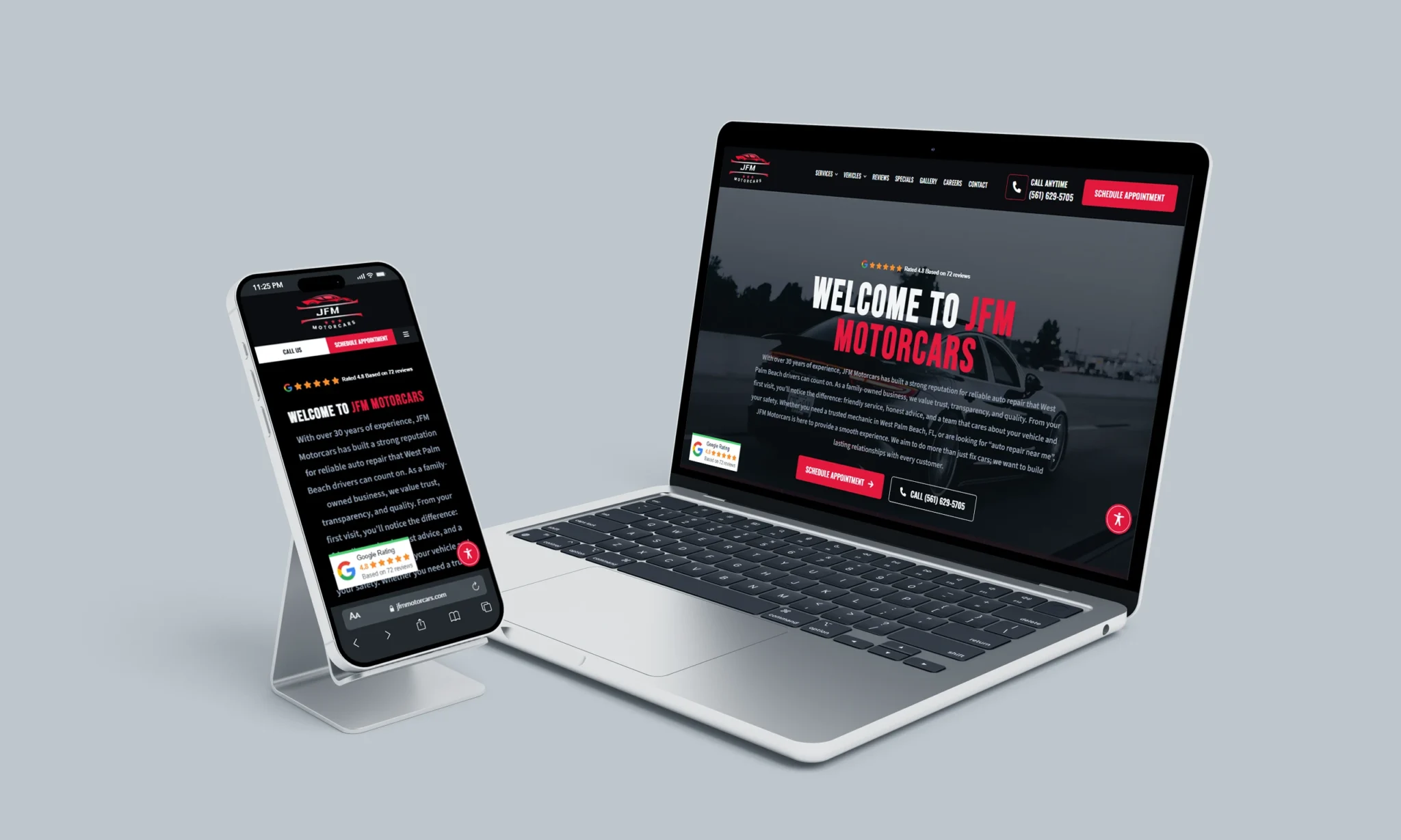
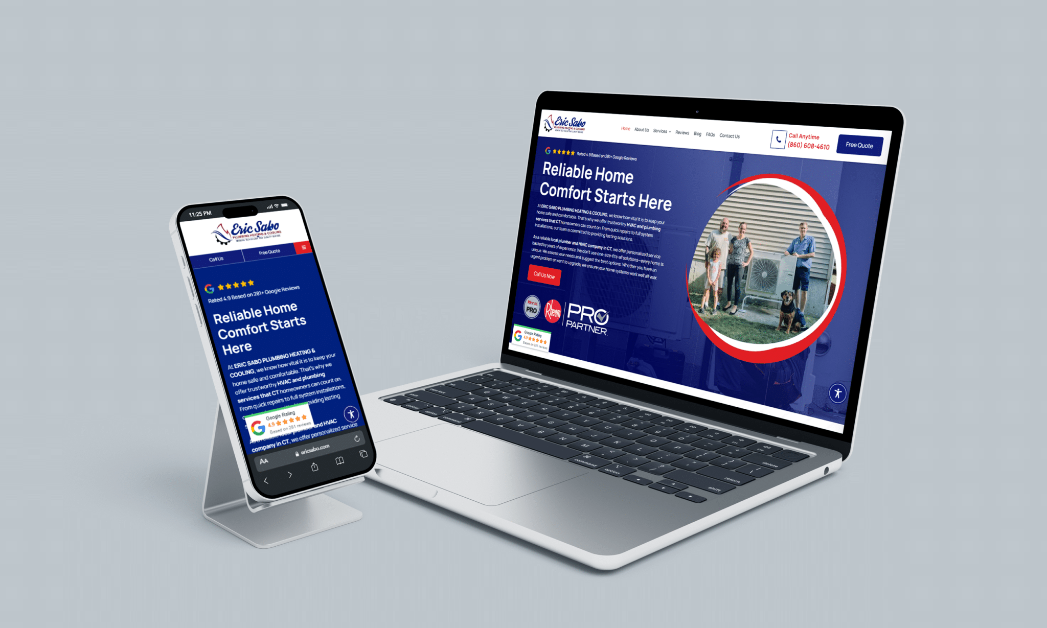
- Ensure Mobile Optimization
- Build a Stunning Website for Your OB-GYN Practice with Stratedia
Essential Web Design Features for OB/GYN Practices
Learn how to design an OB-GYN website that reflects trust, compassion, and expertise with these essential web design best practices.
Whether you’re launching a new OB-GYN practice or updating an established one, a modern, well-designed website is crucial for attracting and retaining patients. Effective website design goes beyond simply choosing colors and images; it involves strategic planning to create a seamless and engaging experience for your visitors.
Read on to discover how to incorporate key web design elements to help your OB-GYN practice thrive online.
Why is Web Design Crucial for OB-GYN Practices?
An OB-GYN website needs to balance presenting valuable, detailed information with an intuitive and user-friendly design. Visitors to medical websites are typically seeking quick answers or preparing to schedule an appointment, and they don’t have time to waste—especially in urgent situations.
A well-crafted OB-GYN website serves three key purposes:
1. Deliver essential updates and resources to existing patients.
2. Attract new patients by clearly showcasing your services.
3. Provide easy ways for both current and potential patients to contact you.By focusing on these objectives, your website will effectively meet the needs of both new and returning patients.
Top Design Features for Your OB-GYN Website
Building your website can feel overwhelming, especially when you’re trying to balance providing detailed information with keeping the site user-friendly and clutter-free. How do you ensure your website is informative without overwhelming visitors? Are there design trends you should steer clear of?
To help you create a website that is both effective and easy to navigate, here are some key design principles to follow for your OB-GYN practice’s site. These traits will enhance user experience, keep patients engaged, and ensure your site stands out in the competitive healthcare space.
Design an Inviting Color Scheme
Choosing the right color palette for your OB-GYN website can be challenging, but it’s crucial as colors can deeply impact a visitor’s perception. Colors carry different meanings influenced by culture, personality, and even personal experiences.
Psychologically, colors can evoke certain feelings in our subconscious. For instance, while red might provoke feelings of urgency or stress, blue is often associated with calm and tranquility.
For an OB-GYN website, it’s important to create a welcoming and soothing environment that helps patients feel at ease. Consider using soft, warm neutrals or tones typically found in cozy, relaxing spaces. Experiment with color generators to find a combination that feels both professional and inviting, helping patients feel comfortable and confident in your care.
Ensure Intuitive Navigation
One of the key principles in web design is making sure your information is easy to find. If visitors can’t quickly locate what they’re looking for, they will likely leave your site and look elsewhere.
When designing your OB-GYN website, put yourself in the shoes of your potential patients. Consider the logical paths they might take to find important information—whether it’s through your blog, service pages, or contact details.
Once your layout is in place, test it thoroughly to ensure it’s user-friendly. A well-organized, easy-to-navigate site not only keeps your content neatly structured but also makes it simple for patients to find the answers they need, enhancing their experience and encouraging them to stay on your site.
Create a Welcoming Space for Communication
As mentioned earlier, patients seeking an OB-GYN want to feel safe, valued, and heard. Your website plays a crucial role in establishing that initial connection.
A key component of this is having a well-designed contact page. Potential patients may have questions before committing to a provider, and an easy-to-use contact form makes it simple for them to reach out. Ensure the form is straightforward and quick to fill out, as a complex or lengthy process could discourage them from completing it.
Remember, prospects are likely exploring multiple options, so be sure to respond promptly. A quick, thoughtful reply can initiate a conversation, build trust, and make your practice stand out.
Additionally, consider incorporating a call-to-action (CTA) button. For an OB-GYN practice, this might direct visitors to schedule an appointment or get in touch with your office. By guiding users with a clear next step, you make it easier for them to take action and move forward in their decision-making process.
Strike the Right Balance Between Visuals and Text
Achieving the perfect balance between visual elements and written content on your OB-GYN website can be challenging, but it’s essential for creating an engaging and user-friendly experience. The main goal is to make your content easy to skim so visitors can quickly find the information they need. This can be effectively done through clean typography paired with relevant visuals.
Breaking your text into short, digestible paragraphs makes it easier for users to absorb the information. Long blocks of text can overwhelm visitors, leading them to abandon your page in frustration.
Incorporating relevant graphics, such as infographics or illustrations, is an effective way to highlight key points and make the content more visually appealing. However, ensure that each graphic serves a purpose, rather than simply filling space.
Choose a clean, legible font that’s easy to read. Avoid overly decorative fonts that could confuse or strain the reader’s eyes. Consistency in font choice is also vital—using too many different fonts can make your site feel disorganized and cluttered.
A minimalist approach is often best. Be intentional with your design, offering the essential information and visuals without overwhelming your visitors. This ensures a smooth, user-friendly experience that keeps patients engaged and informed.
Ensure Mobile Optimization
In today’s digital age, making your OB/GYN website accessible and user-friendly across both desktop and mobile devices is crucial. This is where responsive web design comes into play, ensuring your site looks and functions seamlessly on smartphones and tablets.
As more people rely on mobile devices for browsing the internet, it’s essential to design your website so it adapts to different screen sizes. A mobile-optimized site allows potential patients to engage with your content smoothly, increasing the chances of converting them into leads. A mobile-friendly experience also helps keep visitors on your site longer, improving their overall interaction with your OB/GYN practice and ultimately boosting patient acquisition.
Build a Stunning Website for Your OB-GYN Practice with Stratedia
Your website is your clinic’s first impression—make it count! Partner with Stratedia to create a professional, custom-designed site that reflects your brand and attracts new patients.
From crafting a website from the ground up to integrating powerful SEO strategies, our expert team will guide you every step of the way.
Ready to elevate your online presence? Contact us today to get started, and let’s build a site that drives results for your practice!