In today’s digital age, where consumers access websites on a wide range of devices, from smartphones and tablets to laptops and desktop computers, having a website that adapts seamlessly to different screen sizes and resolutions is essential. This is where responsive design comes into play. In this blog post, we’ll delve into the importance of responsive design and explore how it ensures your website looks great across all devices.
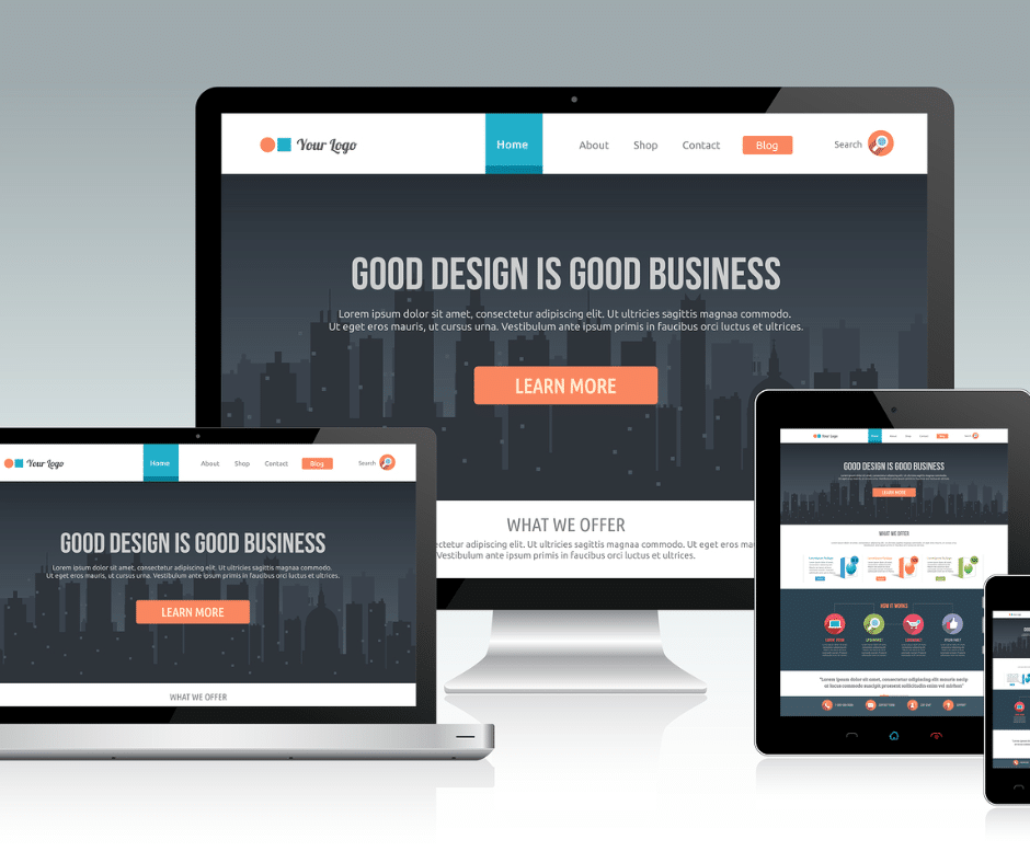
Understanding Responsive Design:
Responsive design is an approach to web design that ensures a website’s layout, content, and functionality adjust dynamically based on the device being used to access it. Rather than creating separate versions of a website for different devices, responsive design allows for a single website to provide an optimal viewing experience across various screen sizes and orientations.
Benefits of Responsive Design:
- Enhanced User Experience: Responsive design ensures that users can easily navigate and interact with your website, regardless of the device they’re using. This seamless experience leads to higher user satisfaction and engagement.
- Improved SEO Performance: Search engines like Google prioritize mobile-friendly websites in their search results. By implementing responsive design, you can improve your website’s visibility and rankings in search engine results pages (SERPs).
- Cost-Effectiveness: Rather than investing resources in creating and maintaining multiple versions of your website for different devices, responsive design allows you to manage a single website efficiently, reducing development and maintenance costs in the long run.
- Future-Proofing: As new devices with varying screen sizes and resolutions emerge, responsive design ensures that your website remains accessible and functional across all platforms, without the need for constant updates or redesigns.
Key Principles of Responsive Design:
- Flexible Grid Layouts: Using fluid grids and proportion-based sizing, responsive design ensures that website elements adjust proportionally to the user’s screen size, maintaining consistency and readability.
- Media Queries: Media queries allow developers to apply specific styles based on the device’s characteristics, such as screen width, resolution, and orientation. This enables the website to adapt its layout and presentation accordingly.
- Scalable Images and Media: By using scalable images and media assets, responsive design ensures that visual content retains its quality and clarity across different devices, without sacrificing loading speed or performance.
Responsive design is no longer a luxury but a necessity in today’s digital landscape. By implementing responsive design principles, you can ensure that your website looks great and performs optimally across all devices, providing users with a seamless and enjoyable browsing experience. Whether they’re accessing your website on a smartphone, tablet, or desktop computer, responsive design ensures that your content remains accessible, engaging, and impactful, regardless of the device they’re using. Embrace responsive design and unlock the full potential of your website in reaching and engaging with your target audience across all devices.
Ensure your website shines on every device! Contact Stratedia for responsive design expertise. Your online presence matters!


