5 Web Design Best Practices for Optometrists
Learn how to create a compelling website for your optometry practice with Stratedia‘s top web design tips. Demonstrate experience, compassion, and trust while ensuring your online presence attracts and engages potential patients.
As an optometrist, your mission is to enhance your patients’ vision and eye health, but have you considered how your website impacts their first impression of your practice? Your website serves as a virtual front door to your business, and its quality can influence whether visitors become patients.
If your website isn’t user-friendly, informative, and visually appealing, you could be losing potential patients. Keep reading to explore five essential web design practices that can elevate your online presence.
Why Optometry Website Design Matters
Your website is more than a digital placeholder — it’s a vital tool for attracting and retaining patients. Here’s why web design is critical for your optometry practice:
1. It Creates a Memorable First Impression
Just as your waiting room sets the tone for your office, your website is often the first interaction potential patients have with your practice. Research shows it takes only 50 milliseconds for visitors to form an opinion about your site.
If your website doesn’t make a positive impression, visitors may leave and look elsewhere for their vision care needs.
2. It’s the Starting Point for Searches
The majority of people — 80% — use search engines like Google to find services and products. When potential patients search for optometry services, your website will likely be their first stop. A well-designed site ensures that you capitalize on this opportunity to connect with them.
Optometry Website Design Best Practices
To stand out in today’s digital landscape, your website must do more than provide basic information. Patients expect a well-designed, user-friendly site that reflects your expertise and care. Here are five best practices to follow:
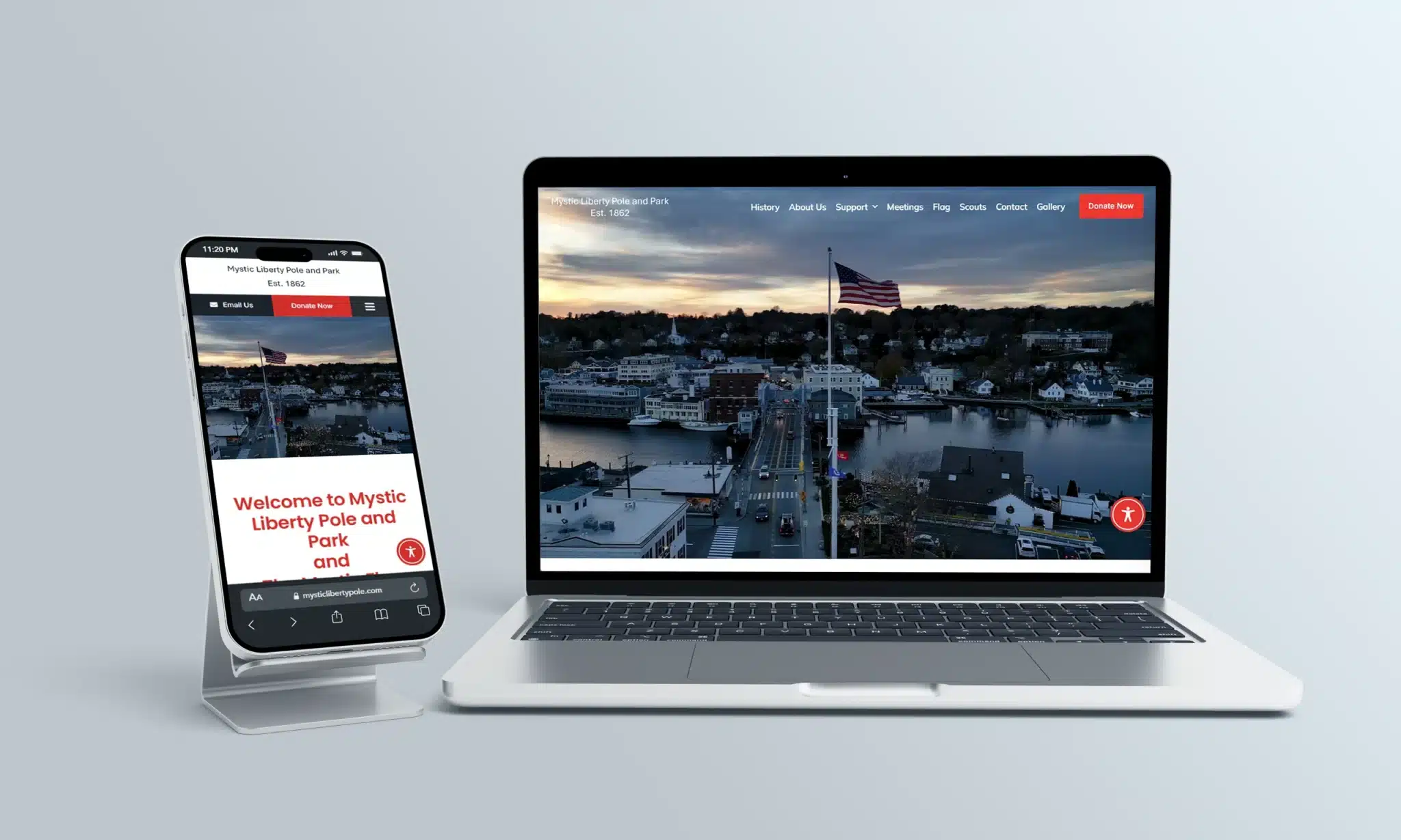
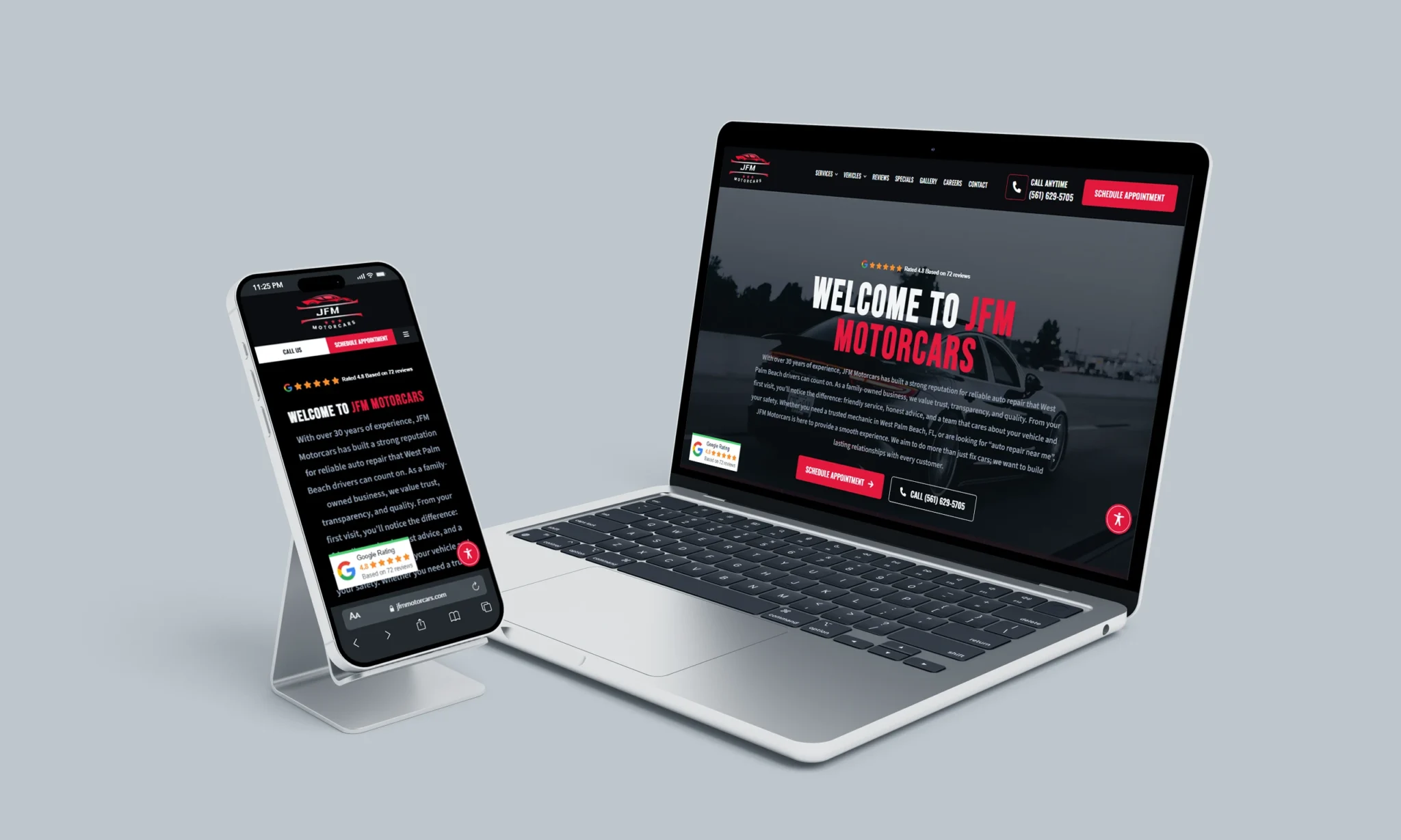
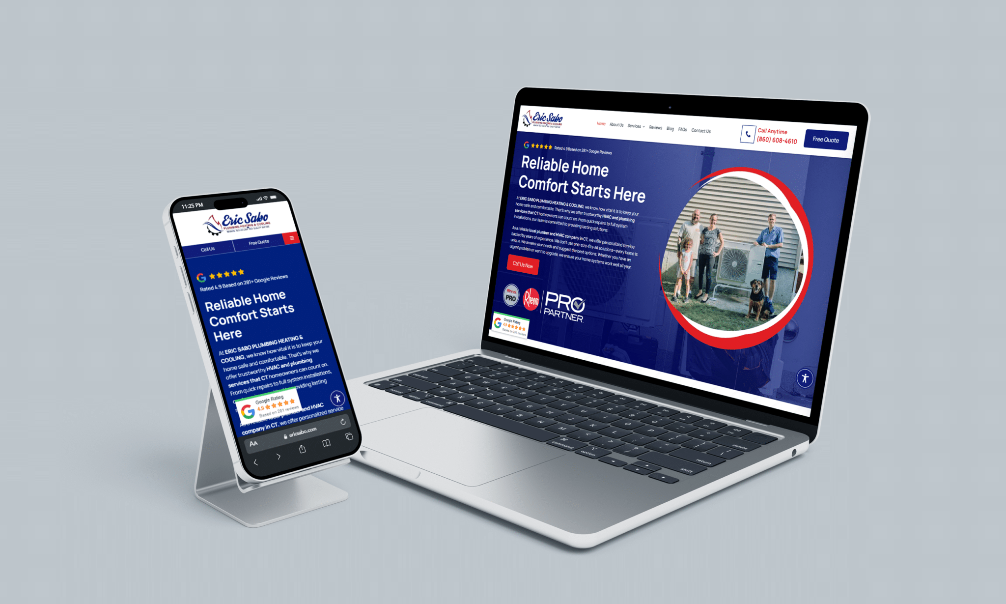
1. Responsive, Mobile-Friendly Design
With nearly half of all online searches conducted on mobile devices, having a responsive design is essential. A responsive website automatically adjusts its layout and content to fit any screen size, ensuring a seamless user experience across devices.
A mobile-friendly site is especially important for local searches, as 50% of mobile users who search for a local service visit a business within 24 hours. Without mobile optimization, you risk losing potential patients to competitors with better mobile experiences.
2. Simplify Your Design
When it comes to website design, less is more. A clean, uncluttered layout directs attention to your content and calls to action (CTAs) without overwhelming visitors.
Cluttered or overly complex designs can distract users and make it harder for them to find the information they need, leading to frustration and higher bounce rates. A minimalist approach ensures your content shines and encourages visitors to explore your site further.
3. Provide Informative and Detailed Content
Your website should serve as a comprehensive resource for potential and current patients. Include detailed information about:
- Services: Explain the procedures you offer, from eye exams to specialty treatments.
- What to Expect: Help patients feel comfortable by describing the patient journey at your clinic.
- Team Bios: Introduce your staff to build trust and establish a personal connection.
- Educational Articles: Share blog posts and articles about eye health, industry developments, and preventative care.
By offering valuable content, you position yourself as an authority in optometry and build trust with your audience.
4. Ensure User-Friendly Navigation
Navigation is a cornerstone of user experience. A clear and organized navigation bar allows visitors to quickly find what they’re looking for without frustration.
Your navigation bar should include essential tabs, such as:
- Home
- About Us
- Services
- Patient Resources
- Contact Information
The easier it is for users to navigate your site, the more likely they are to stay and convert into patients.
5. Use Clear Calls-to-Action (CTAs)
Effective CTAs guide visitors toward taking the next step, whether that’s booking an appointment, calling your office, or exploring a specific service.
Examples of strong CTAs include:
- “Schedule an Appointment”
- “Call Us Now”
- “Learn More About Our Services”
Place CTAs prominently on each page to ensure visitors always know how to take action. A well-placed CTA can make all the difference in turning a casual browser into a loyal patient.
Does Your Optometry Website Need an Update?
If your website doesn’t reflect these best practices, it may be time for an upgrade. At Stratedia, we specialize in creating tailored websites that highlight your expertise and attract more patients.
Our team can deliver a site that combines modern design, seamless functionality, and proven digital marketing strategies like SEO, social media management, and content creation.
Let’s take your optometry practice to the next level. Contact Stratedia today at 860-415-0340 or visit us online to get started. Together, we’ll create a website that works as hard as you do!